︎ Identity, Editorial
︎ Internship
︎ Fall 2020
67 Million years old, “Stan” is the second most complete Tyrannosaurus Rex skeleton in existence.
In 2020, Stan was put up to auction by Christie’s Auction House with an estimated sale price of $8 million, ultimately selling for over $31 million - a world record for any dinosaur sold at auction. I was responsible for developing the wordmark for the sale, as well as contributing spreads to the limited edition sale catalog.

“Nothing like Jurrasic Park.” read the project brief for the wordmark. It was open ended; I was encouraged to explore as many options as I saw fit. My goal was to create a wordmark that was bold and assertive to represent the significance of the sale, while also maintaining Christie’s design values of elegance and cleanliness.

Round One: It’s Bold. It’s Dramatic. And... it’s too much; too “cinematic” for the sale. This first round did capture the weight and impact I was looking to depict, but I knew there had to be a more subtle way of boldly conveying the iconic fossil without literally using bold type.
I moved on...
Round Two: Incorporating an abstract Footprint Icon worked in creating more visual interest. However, user testing showed that the icon was not easy to understand. Ok, so let’s keep the footprint, but move away from the blocky type...


Round Three: After creating a more realistic rendition of the footprint icon and placing it overtop the text, I discovered that the footprint could be used to swap out letters. Hmmm... the idea is there, but I’m not sold on this concept just yet. I should play around with the footprint shape a bit more...
Round Four: Returning to “T. Rex” and swapping out the “E” with the newest footprint wordmark, I found a direction I was much more excited about exploring. I began to move forward in refining this concept.

The Final Wordmark chosen by the seller encapsulated the dramatic weight of the sale while remaining reserved. This wordmark was to be used in the exhibit and the sale catalog.

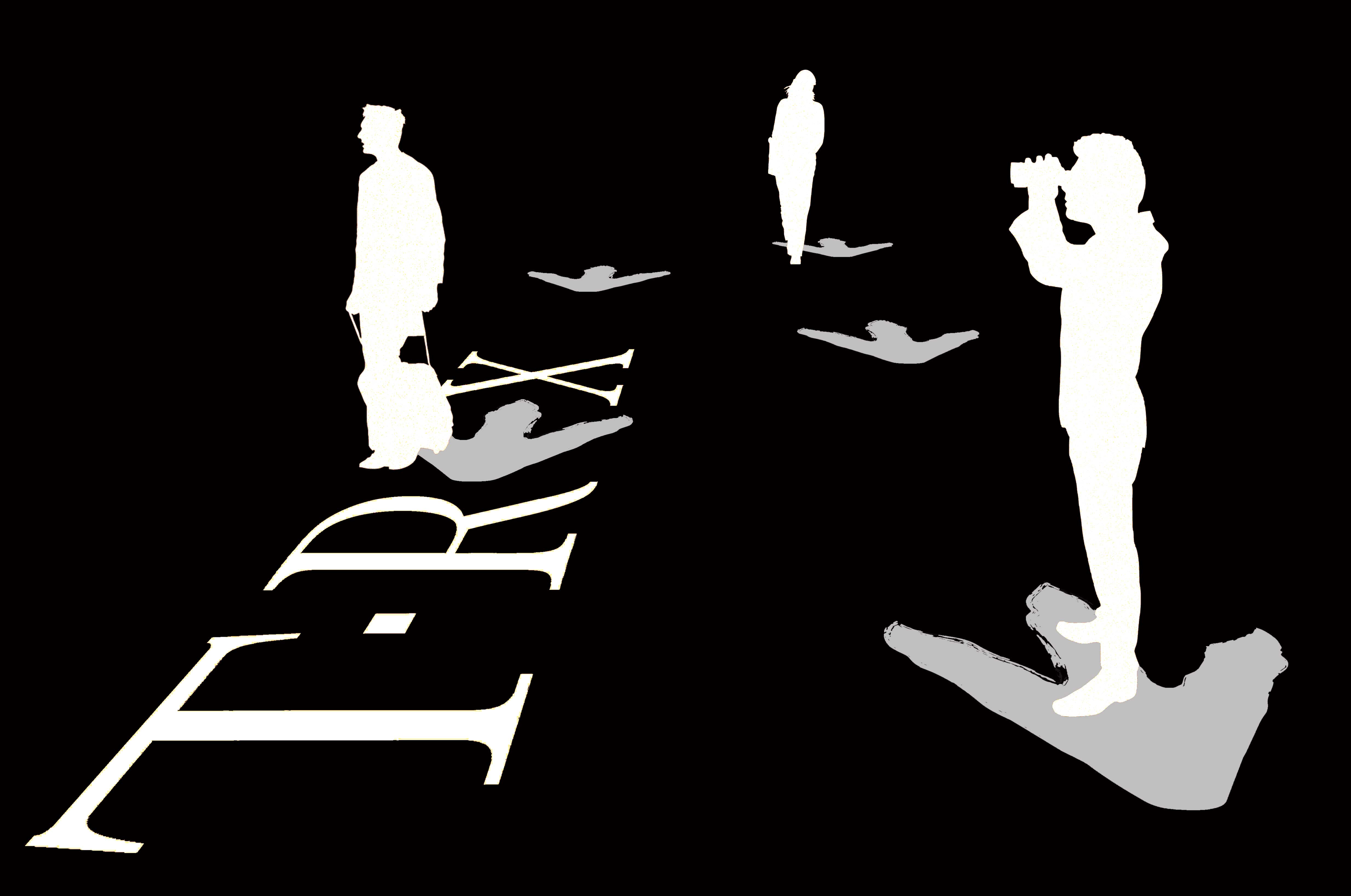
A Wayfinding System was pitched alongside the final wordmark. Initially, these would help the public unfamiliar with the gallery find their way to Stan’s exhibit. However, due to a certain global pandemic, this concept was retrofitted to act as social distancing markers inside the galleries.

A Secondary Wordmark was designed to be used for the exhibit. This wordmark followed the same design principles of the primary wordmark, save for the stylized footprint in order to prevent a conflict of hierarchy.

Exhibit Wall Mounts & Catalog
Contributions


