︎ Creative Direction, Editorial
︎ Typography Studio
︎ Summer 2020
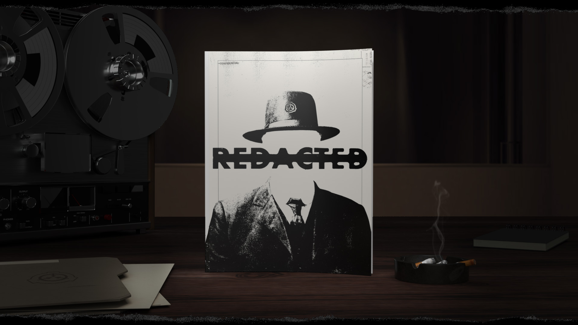
REDACTED is a magazine you’re not authorized to read. REDACTED was inspired by the mystique of declassified government documents and the creative writings of the SCP Foundation. REDACTED is a story about containment, secrecy, and a lake.
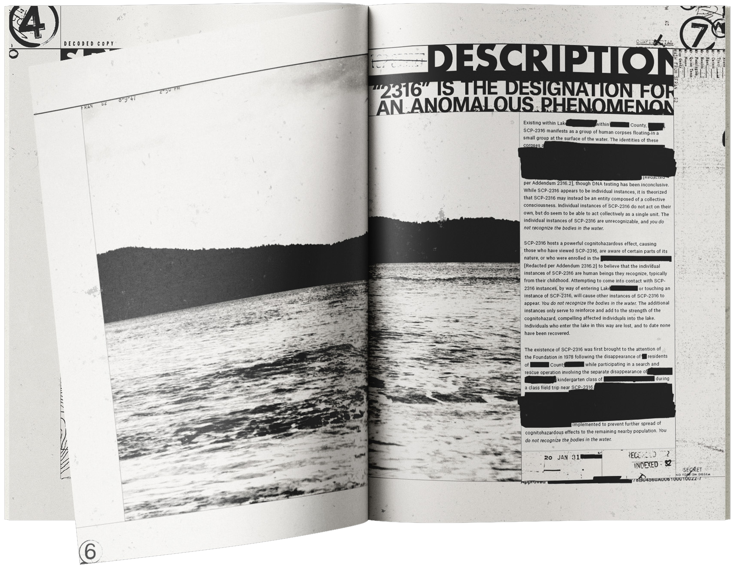
There’s a certain aura that radiates from the black maw of redacted text. What’s underneath all this? Do I even want to know? What if this was hidden for a good reason? For this project I strived to harness this feeling by telling a story through type, image, and spooky black lines.
Read the full story that inspired this project: SCP-2316︎︎︎ by Daniel “Ben” Kaktus
( Uh oh, thats a lot of reading. Trust me though, it helps put this design into context. ︎ )
“SCP-2316”? “SCP Foundation”? What is that and how does it relate to this project? SCP-2316 is a coded designation given to a lake that hosts a dangerous supernatural phenomenon and is the focus of this issue of REDACTED. In the fictional universe of this story, SCP-2316 (henceforth referred to as “the lake”) is currently contained and monitored by a top-secret international organization known as “The SCP Foundation”. The Foundations top priority is to Secure, Contain, and Protect anomalies in order to preserve society and the human race. This story, and subsequently this project, are written to appear as Foundation documents studying the lake’s anomalous properties and Foundation containment procedures.
So what is this “anomaly”? The lake exerts a powerful, mind-altering effect on those who are aware of its existence. Unless properly trained to resist the lake’s effects, individuals will believe that they see bodies in the lake of people they know. Affected individuals begin to perceive the lake speaking to them, persuading them to enter the water, and they feel an overwhelming urge to comply. All those who have entered the lake have never been recovered.
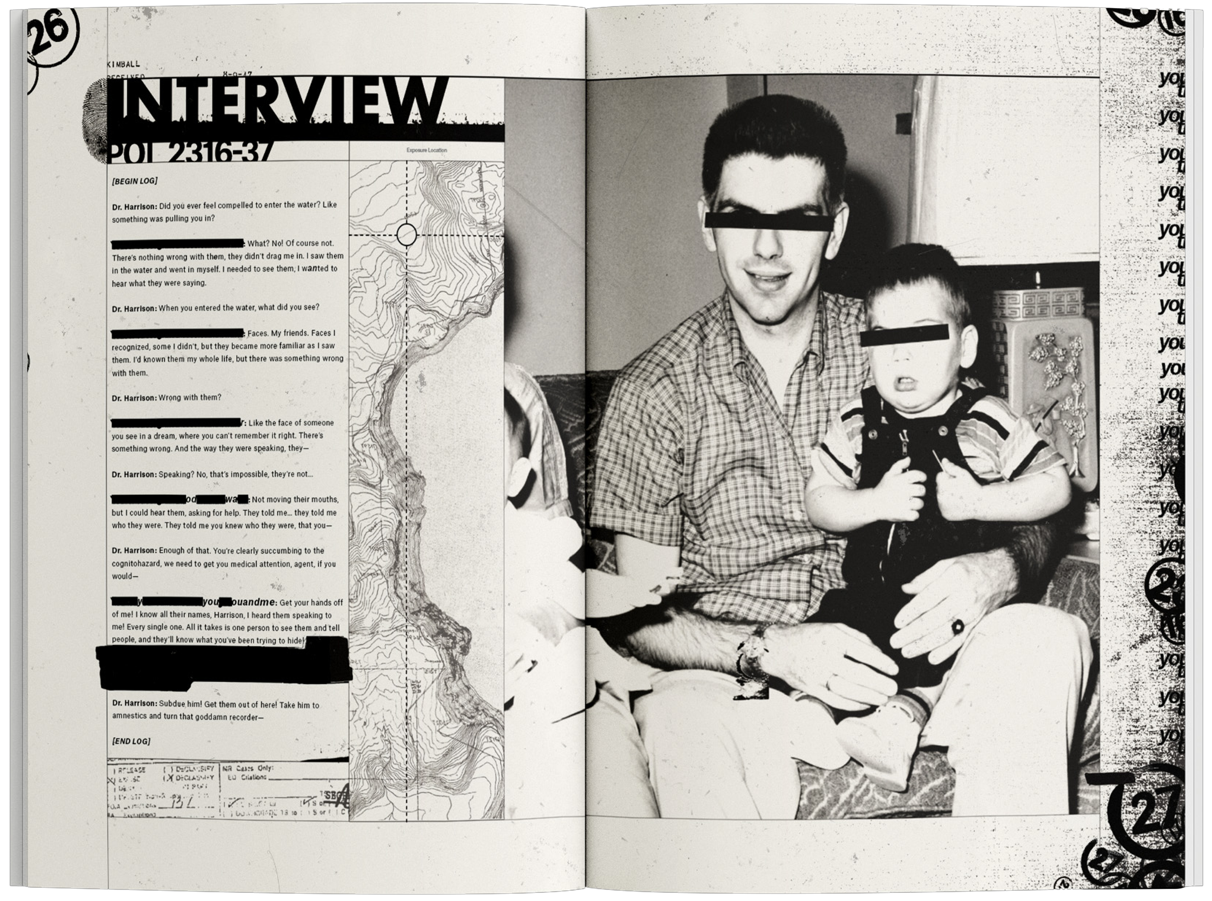
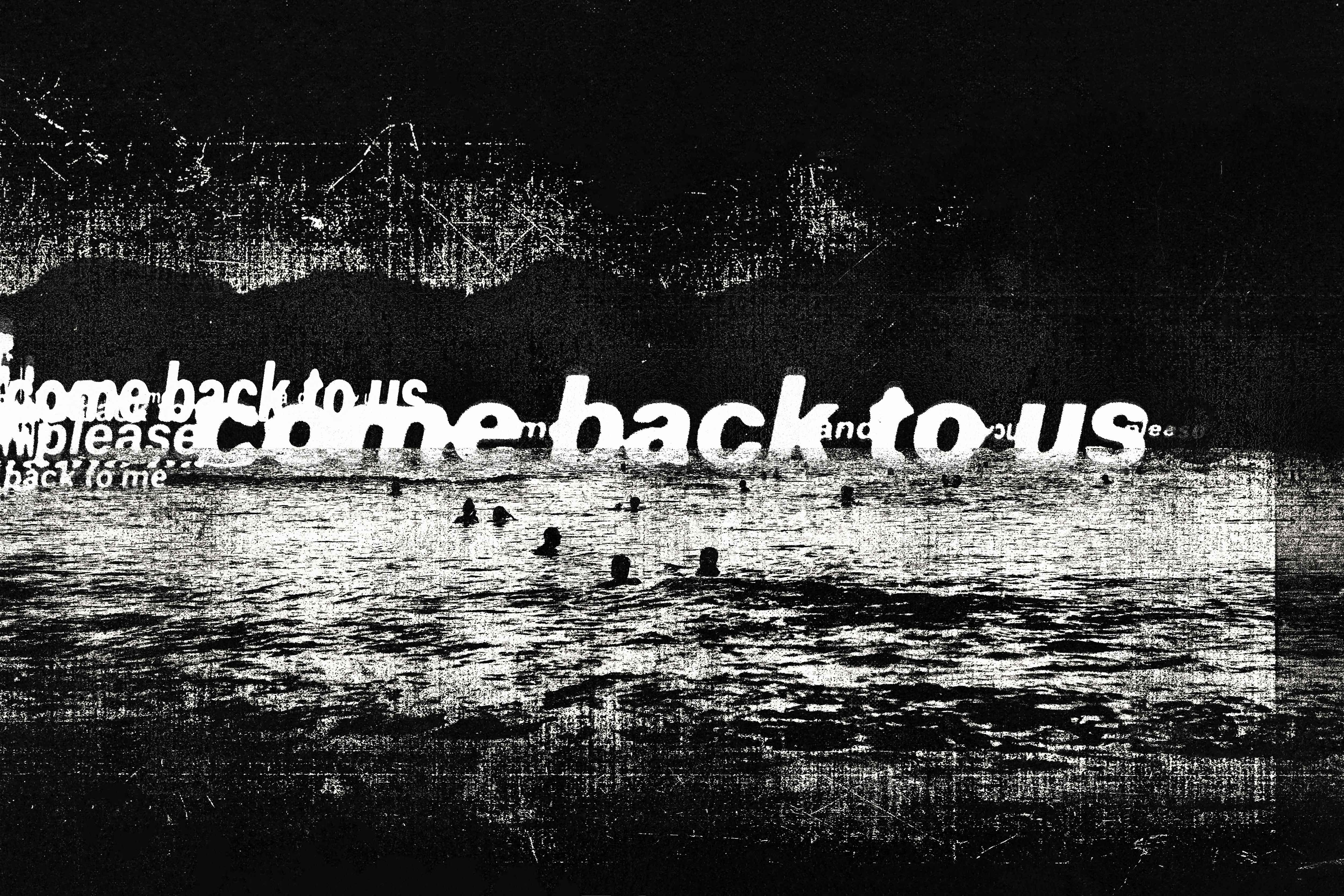
Ok... how does this scary story relate to the design? I’m glad you asked! Through the lens of this story, we are everyday people who have somehow stumbled across documentation of this classified anomaly. Therefore, we are left vulnerable to the lake's mental effects. As the story progresses, the format begins to shift as the lake begins to speak to the reader, asking us to “come back to them”. With this design, I wanted to create a dynamic graphic system that reflected the aura of redacted bureaucratic documents that slowly morphs into another system that communicates a paranormal entity speaking directly to the reader.
Got all that? Just remember, you do not recognize the bodies in the water...

The Typography System needed to be versatile and capable of degrading over time. I found that bold, assertive type helped convey the authoritarian feel I was going for, as well as remaining legible under heavy amounts of texture.

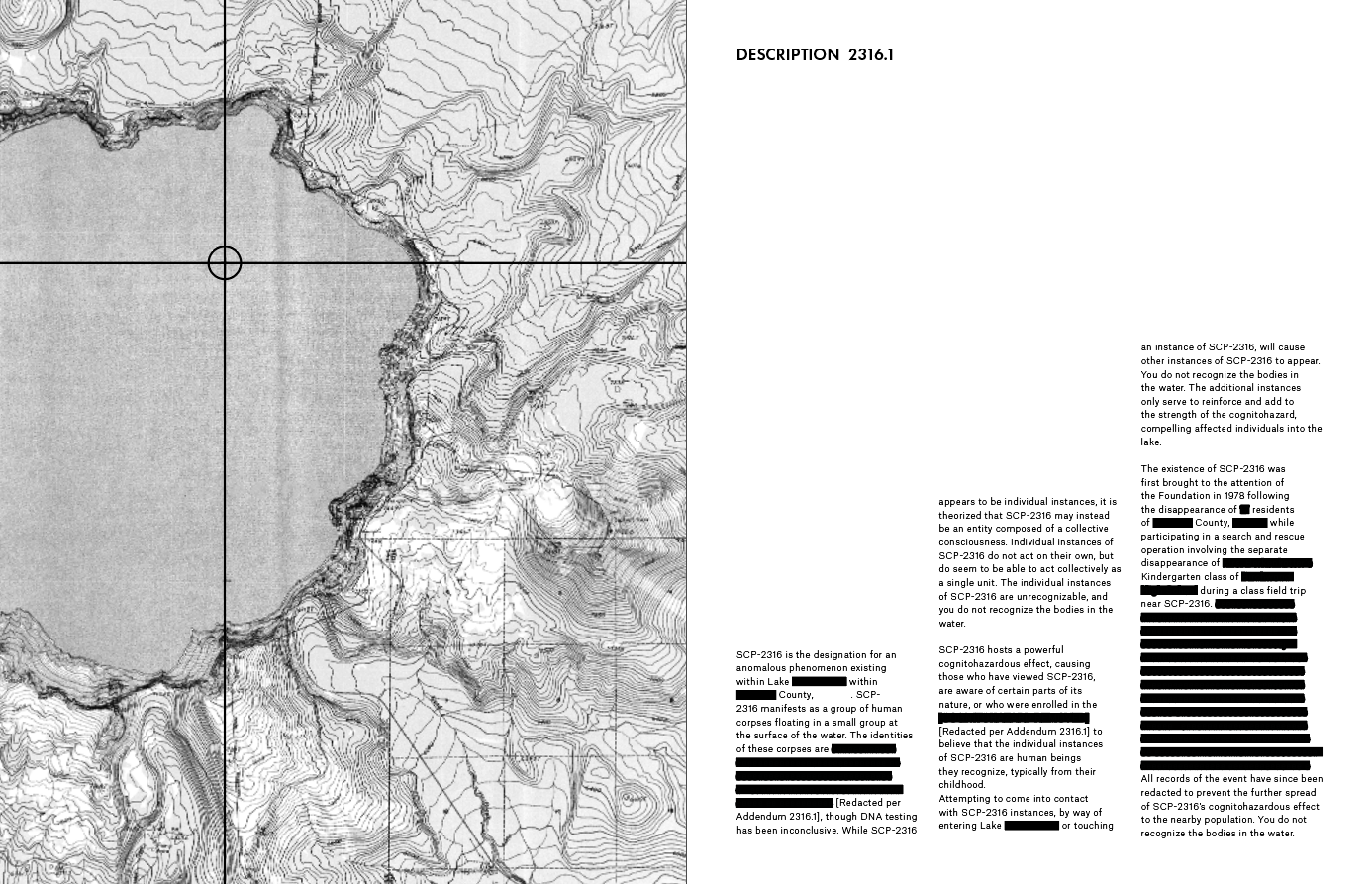
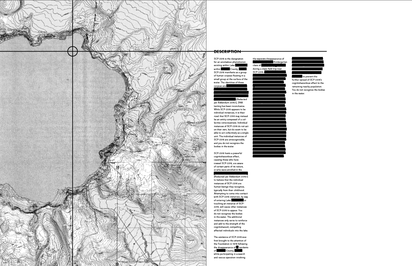
Developing an interesting bureaucratic style took considerable time and effort. Upon studying declassified files, I observed that there was no unifying style with regard to formatting. However, worn elements such as coffee stains, photocopy marks, and bleeding ink littered the documents. Incorporating these as graphic elements, as well as having the text “contained” in boxes, allowed me to develop a style of bureaucracy that was unconventional, but retained the core elements of real documents.

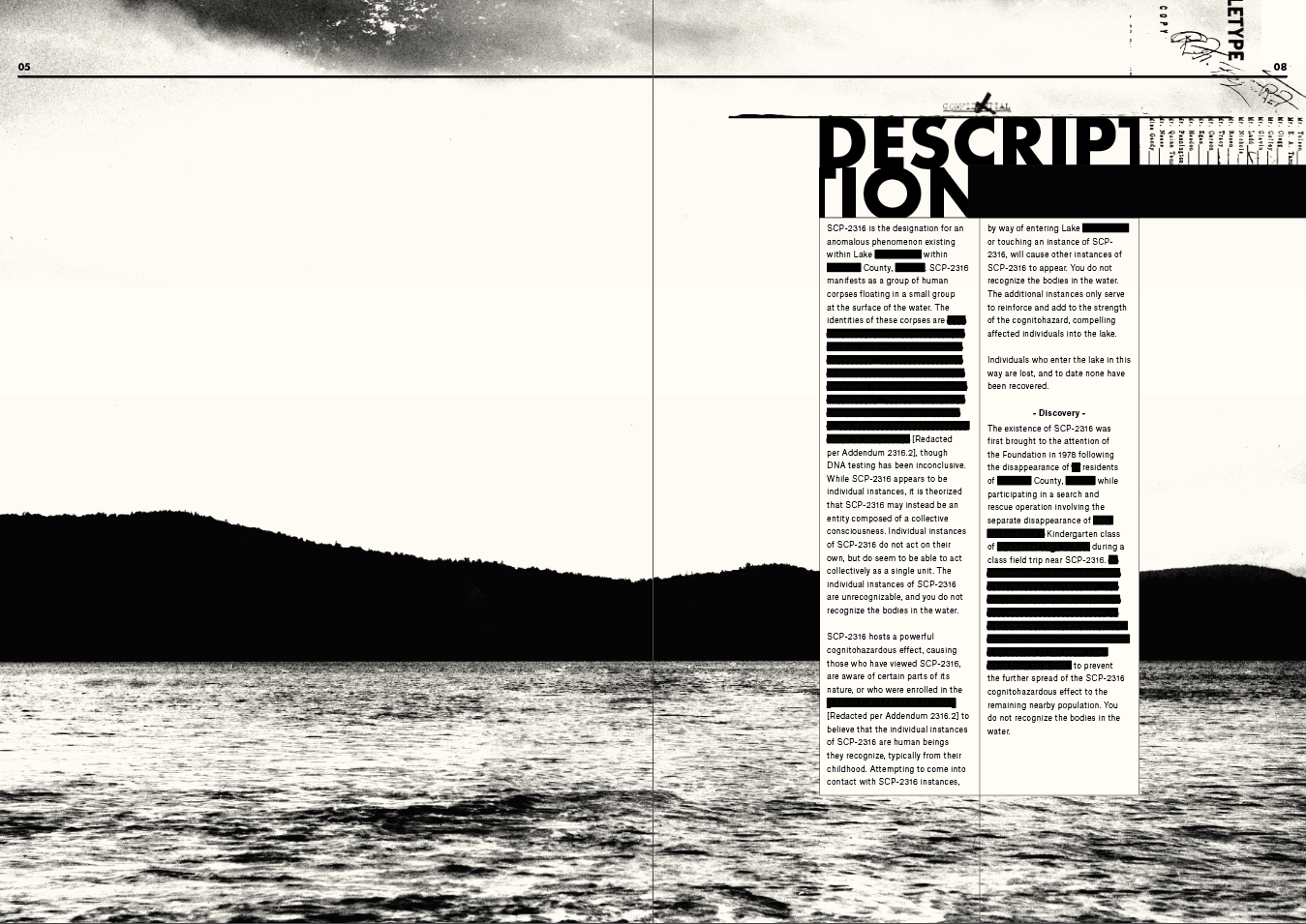
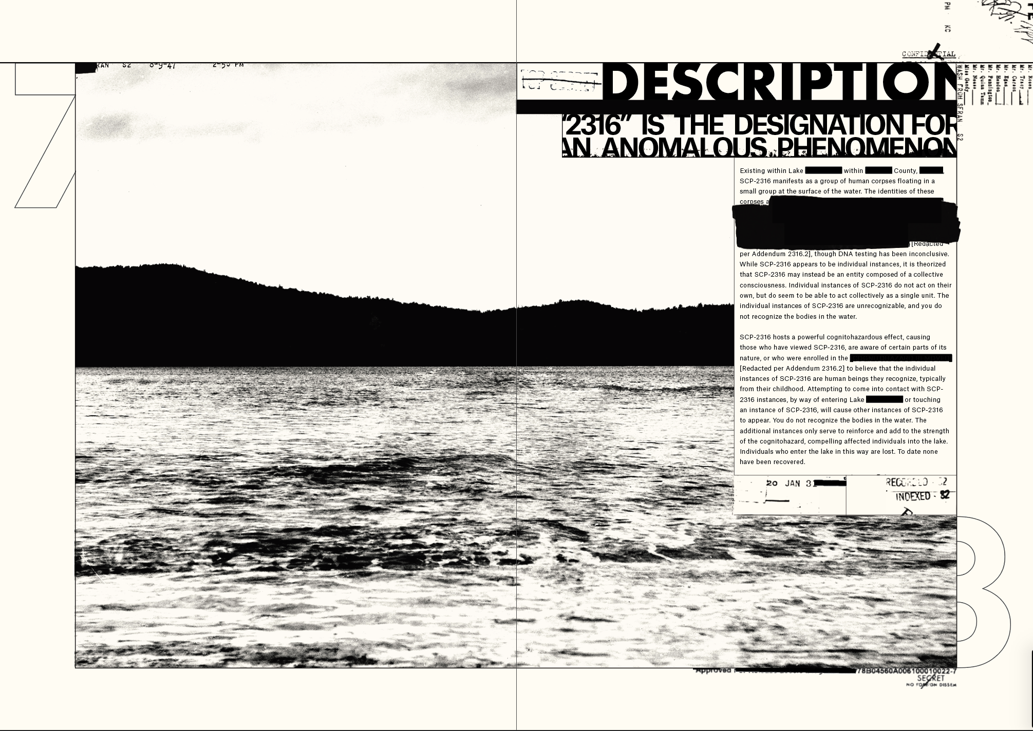
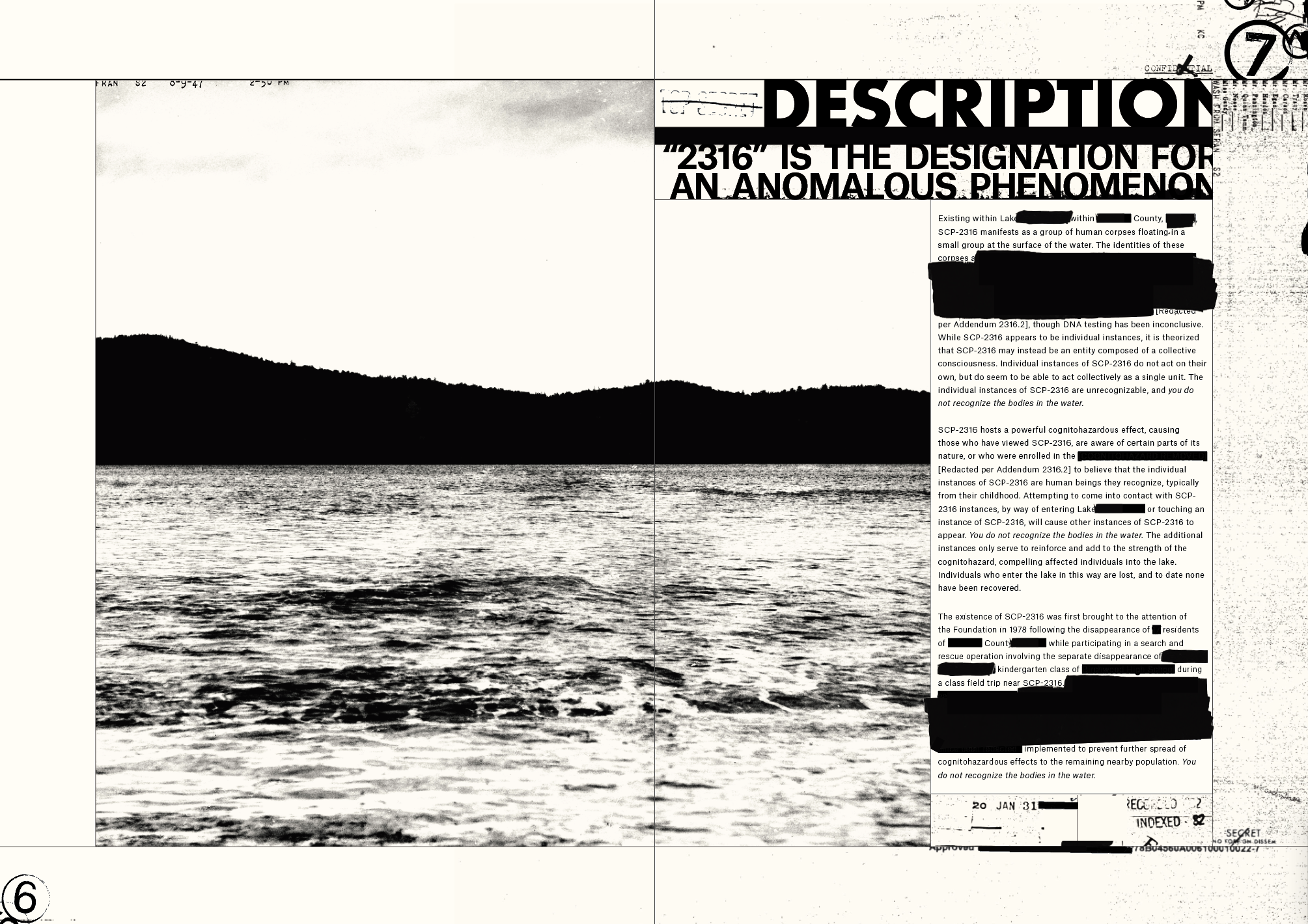
Distorted Imagery peppers the latter half of the spreads. Uncontained type runs rapid—warping and colliding letterforms are used to convey the sense of an otherworldly form of communication.

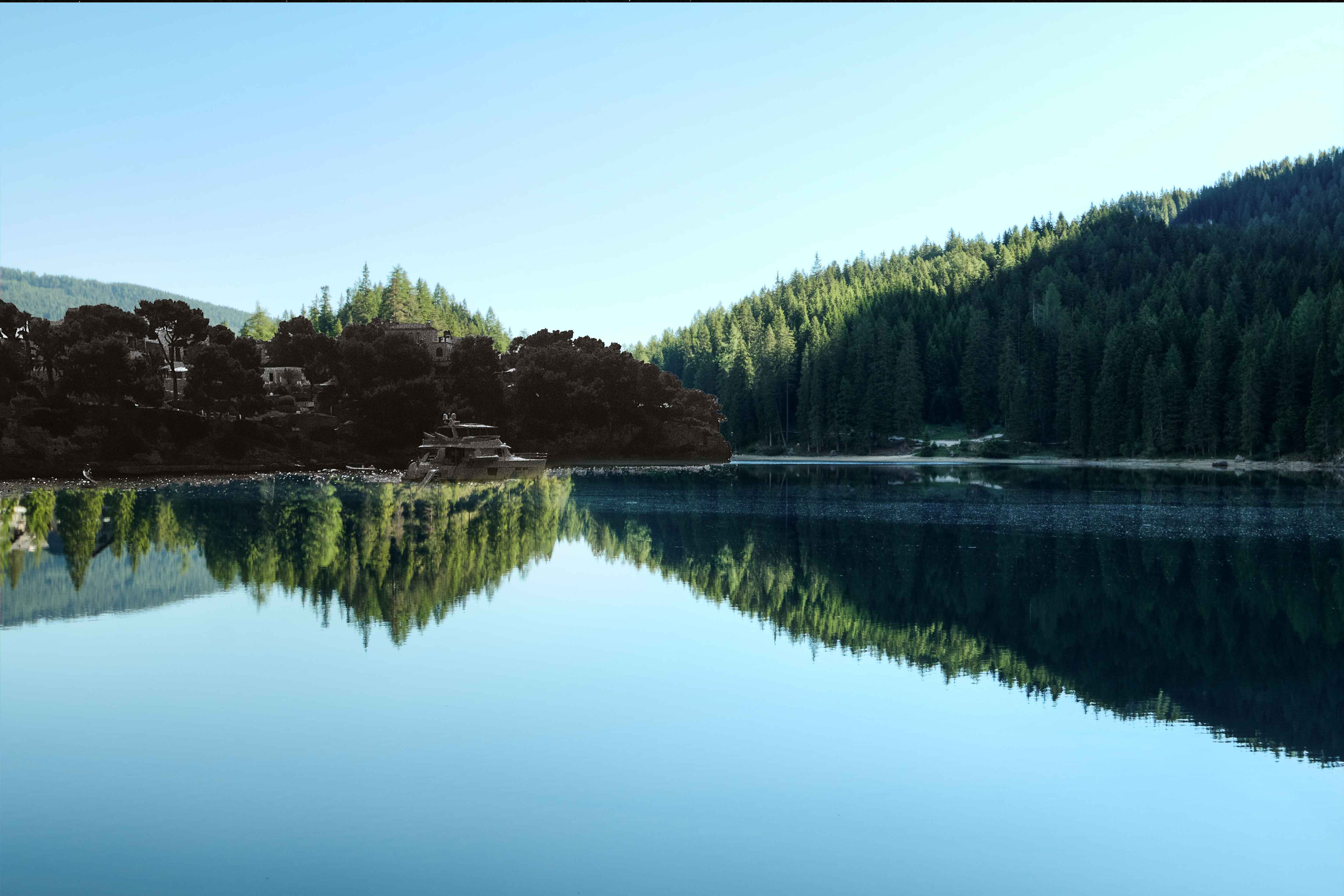


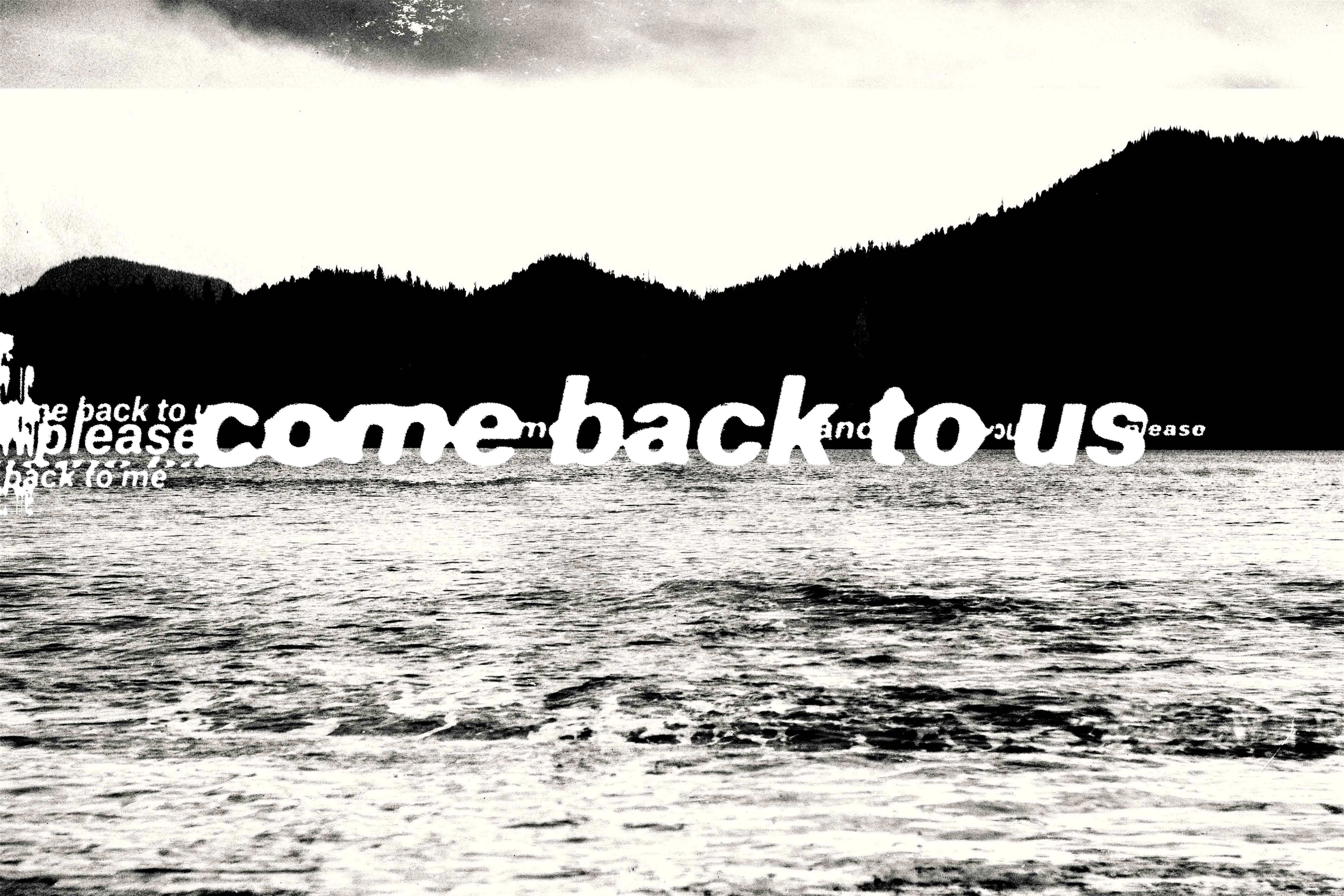


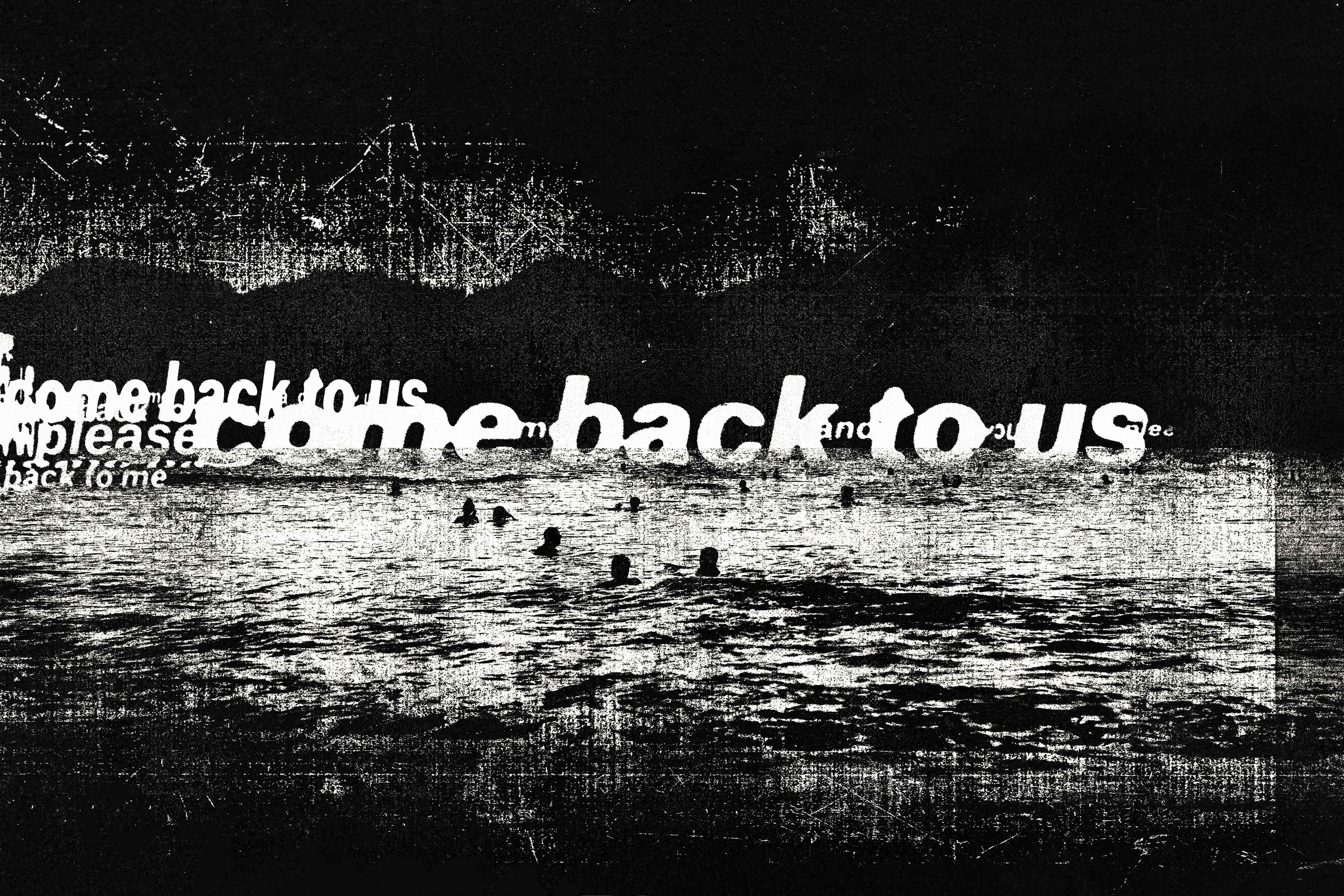
Final Spreads & Further Applications


